 Dynamic, expanding, dropdown… These are all terms that are often associated with interesting and, sometimes, fun interface elements. But, they can also contribute to the obfuscation of the interface and deterioration of the User eXperience.
twhirl, a desktop Twitter client, was recently upgraded. Within twhirl‘s upgrade were some needed, and fully appreciated, improvements to the User eXperience — most notably, along the lines of Usability.
While the interface change was not major, in terms of pixel area within twhirl, many (myself included) have found that this simple change has dramatically enhanced their experience of the product and, in turn, their interactions with Friends and Followers on Twitter. twhirl’s upgrade has also provided us with an opening to the topic of the oft encountered, lesser User eXperiences that hide more and reveal less than most people’s corresponding expectations and desires.
Before talking more about the nice new bits of twhirl, let’s first discuss and understand which information and design decisions can lead to confusion and frustration, and why an interface should be kept simple and reveal more.
Hidden Actions
Hidden actions and hidden information result in hidden choices, slowed decisions, and confusion. The less searching, less thinking, less clicking, the better the user’s product experience will be. There are many commonly found interface elements that work against users’ product experiences, two of which are drop-downs and scrolling lists.
Down and Out
 |
Drop-downs always require at least 2 clicks to use – one click to open, and another click to make the selection.
The information contained within a drop-down interface element is hidden. Simply to see or reference the available options that the user has, that user first has to open it. The deficiency of this type of interface becomes even more apparent when the drop-down contains actions, as opposed to attributes. Actions typically necessitate greater engagement by the user than attributes – after all, people use an interface to accomplish some task (through action). And each of these actions, via a drop-down, always requires 2 clicks; 2 clicks repeated again and again do not present a simple experience.
The drop-down also suffers from other ailments. In many situations, when a drop-down has been opened, some other part of the interface becomes covered, unnecessarily hiding other choices or even information that may soon, or immediately, be relevant to the current decision process.
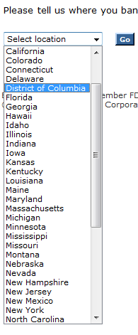
Many websites, for example, use drop-downs to allow the user to indicate within which State they reside. The information applied to the drop-down results in a very long list, one that needs to be carefully scanned and scrolled through until the desired answer has been located – a very cumbersome process.
Instead of using the drop-down, the user of the product can be better served with more obvious, more revealing (of information and intention) interface elements. In the previous example of the State selection drop-down, one can provide the user with a basic textfield. Everyone knows how to type the correct State; and for those that make a mistake (e.g. typo), backup the less confusing interface with sound error checking, correction, and prevention.
Needless Scroll
Scrolling lists exhibit many of the same Usability shortcomings familiar to drop-downs. Scrolling lists do not allow for everything to be easily seen at the same time – they require scanning and scrolling.
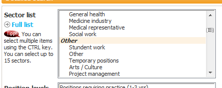 |
An application of scrolling lists, that I am sure you have used within numerous online products, is multiple item selection. An example of this implementation is one in which the user is prompted to select their favorite five items from the entire list. Not only does this implementation result in shielding all of the available options from view (how do you know what five to pick unless you know everything that is available?), the scrolling list also hides many, or all, of the selected items – concurrently hiding from view possible mistakes made in deselecting earlier selections.
Here too, the User eXperience can be improved through simplification and revealing more. Selecting from a list that reveals all available options simplifies the decision process. Selecting my favorite five items from a list that reveals all available options, not only simplifies the selection process, but also helps prevent me from making mistakes (e.g. accidentally deselecting the wrong item).
Wrong Dynamics
Of course there other dynamic elements, regions of the page that appear and disappear, menus and windows that conceal portions of a product’s interface, et cetera, that also exhibit many of the similar downsides as drop-downs and scrolling lists. The important lesson that can be applied to many forms of interface element is that, through some small changes in a product’s interface, through revealing more, the product experience can easily be improved.
A Brisk twhirl
Among the many pluses that twhirl has always had in its favor is its Usability, within a simple and pleasant User eXperience. twhirl has always done well in capturing the key features, and primary goals and desires, of Twitter and the Twitter user base. Prior to the latest product upgrade (version 0.7) the default interface looked like this…
 |
The primary actions of the average Twitterer (Twitter user) are viewing ones timeline and tweeting. Tasks such as filtering, customizing, refreshing, and deleting tweets are given lower priority, but remain a simple button click away. However, in version 0.7 of twhirl, actions of a bit more importance, and more frequently used, are nowhere to be seen – they are hidden in a drop-down.
 |
The hidden actions allow the user to check for replies or direct messages (and more). These are very common actions performed by the average Twitterer – on Twitter it is difficult to be certain that you did not miss a tweet, therefore checking replies and direct messages become a fairly common occurrence. twhirl 0.7, presents a drop-down, containing actions – actions that can be useful to the product’s users.
With just a tiny change, in twhirl 0.8, by revealing more and elevating valued actions, users received a simpler, more enjoyable, easier to understand and act upon interface, that encourages greater interaction with the product and, in turn, greater engagement with fellow Twitterers.
 |
Balance is Key
The key to improving a product’s User eXperience is not always obvious and is most often done iteratively through ongoing tweaking and upgrading.
With revealing more and improving the overall User eXperience come challenges to find …
- balance between decision overload and finding what you want to be able to do,
- balance between presenting relevant information and hiding important information,
- balance between temporal elements and information overload, and
- balance between the abstract and the obvious.
The goals of any User eXperience shift over time. The primary activities and information may change, but the path to many improvements in User eXperience remains constant – to reveal more. The ‘more’ may change, and pose new and exciting challenges to the overall product experience, but there will always be room for improvement, even in an excellent product, as twhirl has further demonstrated.
For more reading…
- Drop Downs, Fly Outs, and Accordion Site Navigation
- Can we do Better than Dropdowns? Is there even a problem?
Enjoy!
Jeremy Horn
The Product Guy
| Add to Social Bookmarks: |  |
 |
 |
 |
 |
 |
 |
 The Product Guy
User InterfaceHere are some of the ideas for the User Interface. In addition, I want to rievew the flow of every screen.First off, I think the Season Play screens need to be rievewed, see if there’s a way to make them more clear, and to be able to quickly get back to the main screen.Second, Network Play. I need to find where to put You’re playing Billybob, who’s coaching New England or at least some icon that indicates that you’re connected.Finally, create an iPad version!Ok, User Interface ideas:Speed up animation. This is very simple. In fact, I’ve just sped it up a little more (from 20 fps to 25) and am testing it. I’ll look into making this a user option, since faster is smoother, but some may find it too fast to follow.Diagrams on the Kickoff and Return screens, showing Squib, Onside, DeepMove the Menu link to the scoreboard areaMake Go an icon (in fact, all menu bar buttons)Use marching ants to depict current selectionRedo replay screen, put big buttons on fieldMake all controls more finger-friendly. Bigger text on text buttons, visuals.Combine This Version and Coming Soon into one button, News If I hit Done on the animation screen, it skips the results screen. Be sure to show results.Don’t let particles (snow, rain) cover the bottom barHighlight the ball when it’s thrown to make it more visibleLook at dksports.com for real estate ideasLook at Front Page Sports FootballReduce receivers and backs fallingDuring animation, allow user to Skip the rest of the animation, but still display results.Added after feedbackProvide more options when displaying men. Allow user to display (a) position, as now; (b) jersey number; and (c) name. In my leagues, the names will have to be non-real, but once I provide an editor, you could edit the names. Displaying names is going to take some thought, because of real estateProvide DVR controls during instant replay to pause, rewind, slow speed and full speed.On select screens (like offensive play), change tiny circles. Perhaps remove them completely and instead show a decent sized arrow or football next to the current selection.
LikeLike