 (part 3 of 5)
Website: CNN.com
Briefly: CNN’s website was found to be the #2 online news website in December 2007. (read more)
 |
What’s Enjoyable?
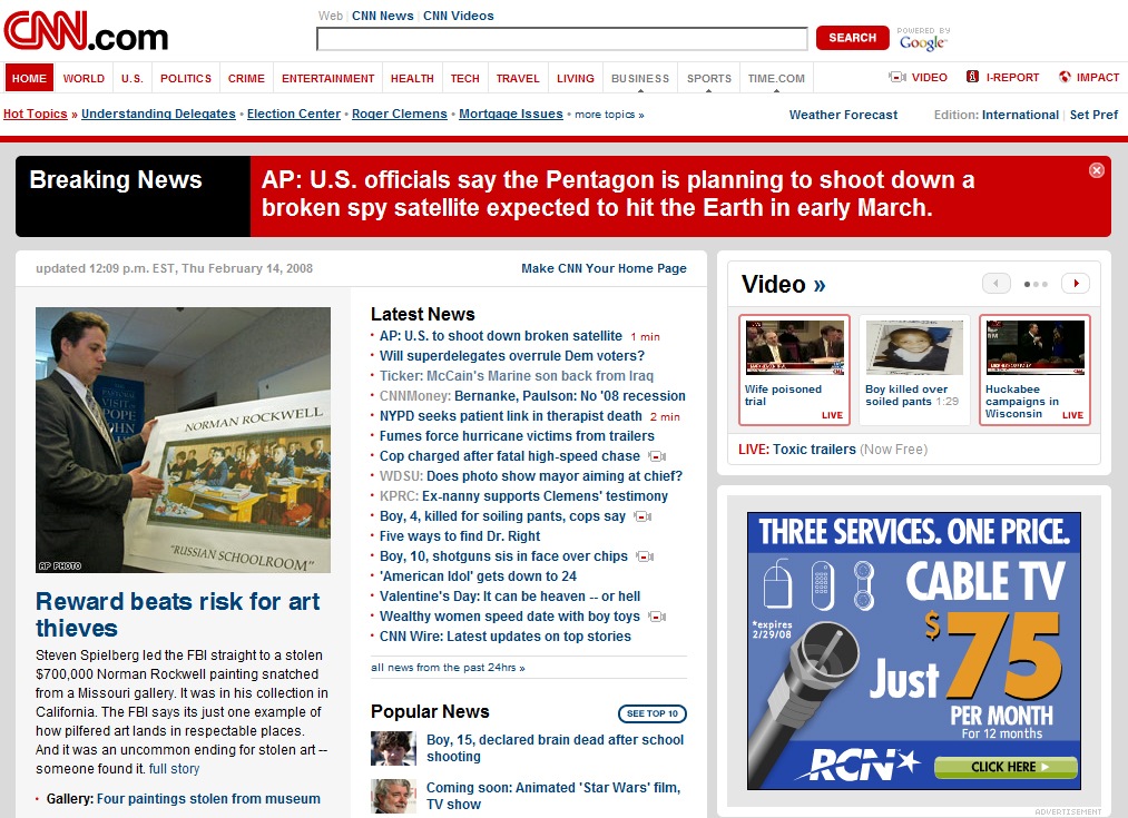
- CNN’s presentation of the full news articles can be found within a very friendly, clean, USEFUL, and easy to read and use interface. This interface…
- Clearly indicates when the article was last updated,
- Provides enhanced accessibility via the placement of on-page buttons for controlling the text size,
- For some articles, can be found to also contain nifty, dynamic, tab-like elements for the exploring of more related information about the current topic without having to navigate elsewhere, and

- Presents a bulleted list of story highlights!
 |
- The prominent placement of the news video component is definitely appreciated by those visitors that are looking to either quickly browse through the latest full-motion news updates or dive into the video aspects of the site.
 |
- The page header allows for (1) the easy navigation of the various sections of the CNN news product, as well as clear identification of the current section, and (2) identification of the latest ‘hot topic.’ With many of the other top online news experiences with such clumsy navigation interfaces, CNN deserves the positive recognition for its solid implementation.
What’s Disappointing or Unsatisfying?
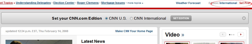
- Unlike many other news sites, CNN provides very little in the way of customization, and no customization of the determination of sections to present, nor their display sequence (a fairly common feature).
 |
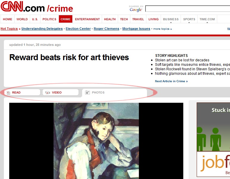
- The non-Home sections of the website exhibit inconsistent layouts and poor use of whitespace. Often the whitespace presentation results in the sense, or feeling, that something is missing or broken on the page.
 |
- The composition of text on the page can, at times, seem disjointed or incomplete. A simple example can be seen on the homepage in awkward wrapping of the article’s age, as well as in the example below…
 |
The third of the top 3 news sites, MSNBC, will be the focus of my next blog update.
Until then, think about & share…
Which website experience do you enjoy more Yahoo News or CNN? Why?
Subscribe now (click here) to make sure you don’t miss any part of this series exploring the User eXperience within the world of news websites as well as other upcoming, insightful posts from The Product Guy.
More Information
- The News is Improving
- Yahoo News. #1 Online News Site.
- MSNBC. An online experience.
- The Top Online News Experience is…
Enjoy!
Jeremy Horn
The Product Guy

Hi tpg.
I couldn’t agree with you more. i’ve discussed this site with my colleagues many-a-times. I personally like the clean, simple, and carefully layed out content. Not too cluttered, yet allowing for all content to be made available very easily.
your synopsis of the site’s design is well done. my hat off to you pg.
sagart.
LikeLike
does anyone knows if there is any other information about this subject in other languages?
LikeLike