Good Times.

Remember the days when you could go to Netflix, pop in to see the latest New Releases and other DVD’s Releasing This Week, select a few goodies that you have been waiting for and then hop back out? You know the feeling…Quick & Simple.
Gone?
Good times they were indeed. Yep, sometime within the past few weeks the same section that so many people enjoyed, and quite simply, took for granted, is gone and has been replaced with a virtual DVD shelf, sadly reminiscent of those found in a real DVD rental store.
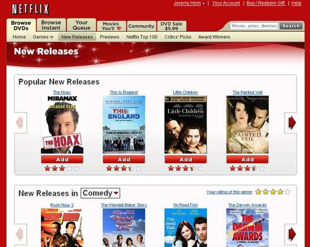
Netflix has (re)captured the experience of wandering around a movie rental store with 5 virtual shelves of DVD’s. The frustration of not finding what you want, the time consuming aimlessness and numbness that comes with staring at the seemingly endless walls of DVDs, the walking of the aisles, back-and-forth, seeking, hoping to find something, anything worth watching can all be found on the new page that replaces all the previous pages of the New Releases section on Netflix.
Why would they do this to us?
The new interface has a clear design goal and is Netflix‘s attempt to offset the demand on the highly popular items and guide users to select the less popular of the new releases. Netflix always has the challenge of meeting demand for the latest and greatest. As a matter of fact, the recommendation algorithm is tuned to try to address this problem, by recommending less demanded, hopefully relevant DVD’s for your viewing pleasure. While this approach makes sense for recommendations, it is just silly to apply that philosophy to the New Releases section.
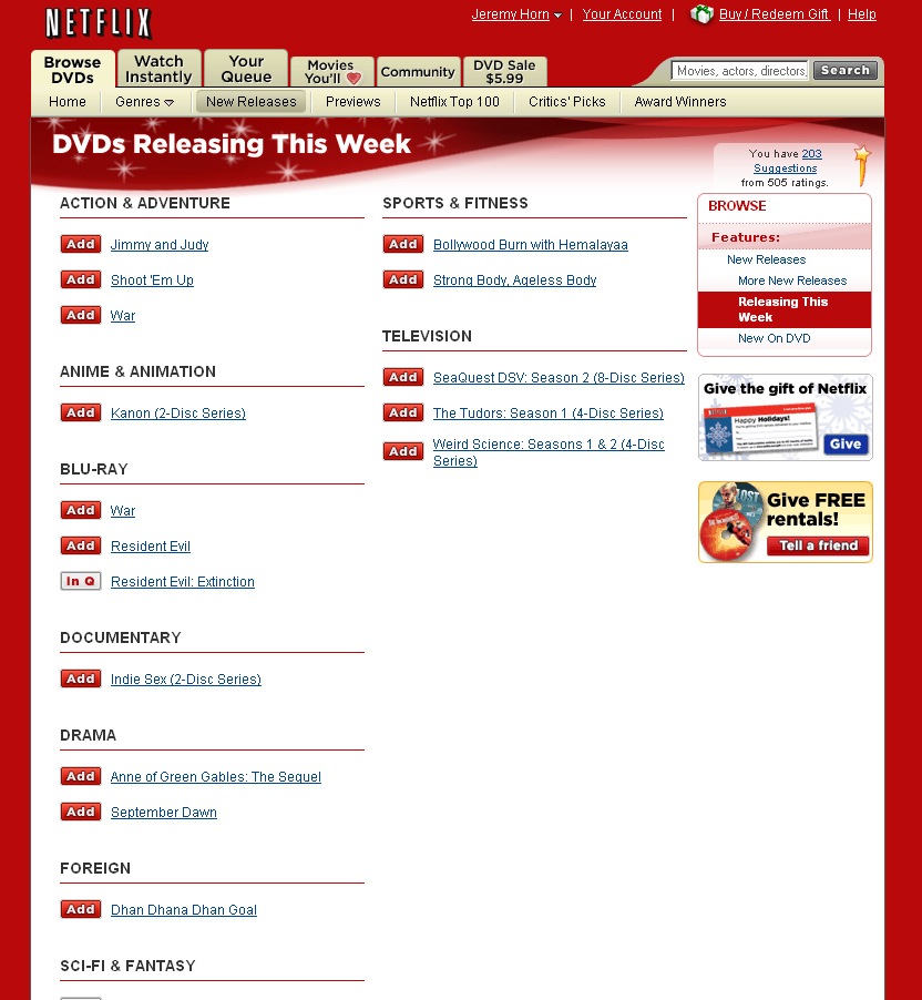
New Releases & Releasing This Week
Selecting New Releases or any of the sub-pages, e.g. Releasing This Week, clearly indicated action by the Netflix customer to be presented with a straight-forward, factual and easy to use presentation of the new and upcoming releases.
People don’t appreciate the feeling of having been tricked or forced into an unnecessary decision process. As a general lesson, it is always important to deliver on the expectation formed via the text and content that drives the consumer’s action. A customer actively engaging the New Releases section is correct in their expectation of clear, direct, and simple presentation of facts. When people want suggestions or recommendations as to what they might want to see they will ask for, and welcome, those recommendations.
The manipulation of the customers’ selection and experience of loss of control over their interaction within the Netflix product environment will not be welcomed, especially in an area that was once easily and happily utilized and valued.
No one appreciates feeling like they are losing control or are being herded down a road not chosen. Just take a look at some of these sites I have come across discussing this recent change..
- http://forums.highdefdigest.com/showthread.php?p=562118
- http://www.hometheaterforum.com/htf/sd-dvd-film-documentary/266507-netflix-new-week-link-gone.html
As a Matter of Fact
Directly from the press room at Netflix.com you can find the following excerpt…
“Netflix, Inc. (Nasdaq: NFLX) is the world’s largest online movie rental service, offering more than 7 million subscribers access to 90,000 DVD titles plus a growing library of over 5,000 full-length movies and television episodes that are available for instant watching on their PCs. The company’s appeal and success are built on providing the most expansive selection of DVDs, an easy way to choose movies and fast, free delivery. Netflix has been named the #1 rated Web site for customer satisfaction for five consecutive periods, according to a semi-annual survey by ForeSee Results and FGI Research in the spring of 2005, the winter and spring of 2006 and the winter and spring of 2007. In the fall of 2005, Fast Company named Netflix the winner of its annual Customers First Award. In January 2007, Netflix was named the Retail Innovator of the Year by the National Retail Federation.
Netflix has revolutionized the way people rent movies – by bringing the movies directly to them. With today’s busy lifestyles and consumers demanding more value and control, it’s no wonder that Netflix has become the preferred online provider of the home entertainment experience.”
Pasted from <http://www.netflix.com/MediaCenter?id=5379>
Netflix, it is clear, from your own Press Packet, that you recognize the value that people find in what you provide(d). However, before it is too late, before your core values are compromised, before this update becomes a misdirected trend, recognize that it’s time to iterate past the current incarnation of the New Releases section… going to the previous version is NOT a step backward.
The End
 Netflix, I know you want everyone to browse and select the less popular items. But, if people wanted the Blockbuster (the brick-and-mortar store), wandering around the store, experience, they would go to Blockbuster. People go to Netflix because your interfaces help them quickly — usually — get to what they want, see what is coming out this week, what just came out, and make a decision, all in a short timeframe.
So, stop forcing your customers to browse the virtual DVD shelves and bring back the old interface. I am sure everyone is open to something better, something that helps people do what they want to do at Netflix: get a new movie, see what is coming out. Your customers, myself included, don’t want to stroll the Netflix “aisles” in the hopes of stumbling upon something.
Netflix is an online product that I usually point to as a company that does the online user experience right. However, with this new user interface, I can only award this “upgrade” 1 star out of 5.
Jeremy Horn
The Product Guy
P.S. Quick Tip. Through the magic of bookmarking I found a back-door to the old interface. Click here & Enjoy!

I have no problem with trying something new, I just wish that these services (Blockbuster.com has recently implemented some unwelcome changes as well) would allow choices of ‘skins’ like you can do with Vb style forums. If that were the case, we could choose ‘old style’ and through that, we could go back to the design interface we like, and we’d also be giving them feedback (voting with our virtual feet) on their site updates and the interactivity of it all.
LikeLike
You are right on the mark. That damn ‘new release’ page is the most horrible thing I’ve ever seen. I used to love logging in and hitting the new release page to quickly see what was out. Thanks for the link to the old interface!
LikeLike