![]() I have been wanting to conduct and share the results of a thorough assessment of Amazon.com for some time — even more so with the website updates that were rolled out just prior to the Holiday season. The goal and timing of the updates were aligned to boost sales performance during the busiest shopping time of the year — making it easier to browse and buy. Amazon reported that this Holiday season was their best ever.
I have been wanting to conduct and share the results of a thorough assessment of Amazon.com for some time — even more so with the website updates that were rolled out just prior to the Holiday season. The goal and timing of the updates were aligned to boost sales performance during the busiest shopping time of the year — making it easier to browse and buy. Amazon reported that this Holiday season was their best ever.
There are many factors that went into producing those record breaking sales performance numbers and one key contributing element was definitely the upgraded user experience (UX).
Real Stress Test
Why did I wait until now to review the new look-and-feel? (a look-and-feel that was rolled out just prior to Q4 of 2007)
| Old | New |
 |
 |
I wanted to really stress test it all. What better way to put the Amazon experience through all its paces than during all of my, and there was a lot, Holiday Shopping!
I browsed. I bought. I interacted and experienced.
I shopped and bought a great range of items from all parts of Amazon.com, from movies to clothes to groceries. I intentionally interacted with as many interface elements and other tools that I could, to (hopefully) help me do my shopping for all the people on all my gift lists. This was a great way for me to experience everything that Amazon had to offer, both old and new.
I wanted to wait until the dust cleared from my REAL stress testing of the new Amazon UX improvements… Holiday and New Year’s shopping… and here are the key topics worth highlighting and discussing…
- The Navigation Experience… Long awaited, but appreciated improvements.
- Some (Not All) Good In-Page Elements… Some good ideas, generally better, but still not good.
- Trapped in Checkout… The surprisingly unimproved and yet a requirement (on the critical path) for any purchase.
The Navigation Experience
The general improvements that can be seen throughout the new user experience within the interfaces are…
| Simpler / Cleaner color scheme | |||
|
|||
| Improved buttons (e.g. shopping cart, list management) | |||
|
|||
| De-cluttered layout | |||
|
One of the biggest factors in the de-cluttering of the homepage (and many of the other sub-pages) is the introduction of the new, expandable, drop-down-like navigation menu. I am typically not a fan of drop-downs. In most cases, interfaces should not hide information from the user — there is no need to make the user ‘hunt for the elusive feature.’ However, Amazon.com has unique interface and experience challenges. In this case, reduction of information and simplification of the decision process was, beyond doubt, needed, and therefore moved the overall experience in a positive direction.
 |
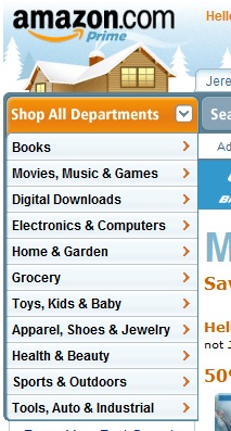 |
The new navigation improves UX by reducing the information overload feeling, but falls short of actually making it easier to navigate.
The down-side of the new navigation is that clicking on the primary category label does nothing. It can sometimes be a very clumsy experience to have to open a drop-down, and slide the mouse pointer over to a sub-category of choosing — for me the menu closed a few times when I overshot, and it also looked like, because of the mouse-over, that I was permitted to click on the primary category (I tried clicking a bunch of times before I figured that out). To simplify this universal navigation element the user should definitely be permitted to click on the primary categories and be permitted to drill down to what is desired from the subsequent sub-category pages. This will have a very good impact on the site’s overall ease of navigation.
Some (Not All) Good In-Page Elements
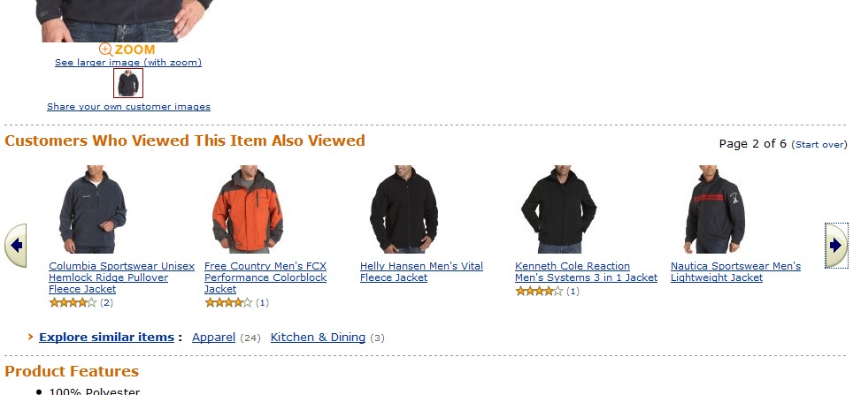
Horizontal Scroller
The Horizontal Scroller is nice and can be a slow way to browse. What would be a better approach would be to expand and collapse a grid of similar items (in this case) from 1 row to many. This would allow for easier comparing of different, multiple rows of items as well as much quicker display of the items of desire, at a glance.
 |
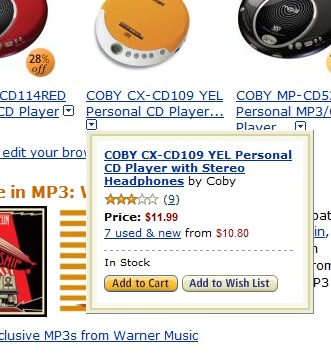
More Information Inline Pop-up
The More Information Inline Pop-up is a strange element within Amazon.com. On one hand, it serves the de-cluttering purpose quite well — only showing me more information when I want it. On the other hand, it is clumsy, elusive, feels sluggish, and inconsistent in usage from one area of the website to another.
On the homepage, to make the Inline Pop-up appear, one has to know to mouse-over the teeny-tiny down arrow. When you make this discovery, you see the More Information, displayed within the screenshot. Definitely hard to figure out — and the slow time-to-display anything definitely doesn’t help to discover this “secret” feature.
 |
 |
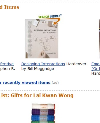
During my Holiday shopping I went all over Amazon.com working really hard to make sure I got something for everyone. (I can’t leave myself out. <wink>) On “Jeremy’s Amazon.com” page I ended up stumbling upon (again, a secret feature) a slightly different, slightly better implementation of the same sort of Inline Pop-up. I still hope that Amazon.com implements a better way to reveal more information than these Inline Pop-ups, but at least on this page, a mouse-over of the product is all that is required to display the More Information.
For the shoppers of Amazon.com to benefit from this feature, it will need to be made obvious and quicker — and, PLEASE, not implemented in a way that hides parts of the very page at which I am looking.
 |
 |
Today’s Recommendations For You
As a Web 2.0 Consumer and seeker of the cool UI design, I really enjoyed the “Today’s Recommendations for You” interface. However, the average shopper is going to be overwhelmed by the sense of information overload. For the younger user, more familiar with blogs and tagging, they should be more comfortable with experimenting and figuring out how to make the most of this mini-UX. Again, users should not have to guess how it works, it should just make sense — otherwise, many will be dissuaded from attempting any interaction.
You click a tag and the Horizontal Scroller is filtered to display only the content associated with the selected tag. Nifty. But, it didn’t help me with any of my purchases — too many pages to navigate, too much scrolling. With a little bit of work here, this may become a tool of more frequent use in my Amazon.com shopping arsenal. More than a little work will be needed to make it middle-aged and senior friendly, two groups that would appreciate the recommendations — but not if the recommendations are done in a complex manner.
 |
Consistency!
OK, not really a “UI component,” but more an important UI nit-pick — consistency is important. It builds comfort and familiarity, allowing the user to have better intuition about different areas of interaction with the site.
I like mouse-overs. They help you know when there is something actionable. They help you know when to click. Notice that in the second screenshot, there is a background highlight (my preference), which does not exist in the mouse-over state of the first screenshot. Pick one (hopefully, my preference) and stick with it. This is one inconsistency example, of many that can be found throughout Amazon.com that, in aggregate, damages the overall user experience.
 |
 |
Trapped in Checkout
Amazon, I applaud your (incremental) user experience improvements. They were long in coming, but I am glad some have arrived and look forward to many more UX improvements that simplify and streamline and help me get done what I want to get done FASTER, EASIER, MORE ENJOYABLY…
BUT, before you re-focus on the rest of the site, please, please, please fix the unavoidable part of your site, the part of the site with the worst user experience – The Shopping Cart Checkout. People want to feel confident, not hesitant, in their purchase decision and enjoy, not dread, making their purchase. No one feels any of that confidence when checking out of Amazon.com. Adding items to the shopping cart and CHECKING OUT should be enjoyed and people will want to do it again and again.
It is odd, that with all of the other improvements that move the user experience forward, that the lowest hanging of the UX fruits, the checkout process, remained untouched. Today, the shopper that wants to checkout, typically a shopper’s final experience with the site before moving on to other activities, cannot easily exit the checkout process nor can they easily modify and add items once the process has begun.
Most websites allow for a free and flexible checkout flow. They recognize that people change their minds. They recognize that people may want to add or remove stuff. They recognize that people don’t like the feeling of being trapped in the process, forced to commit and see it through. You, Amazon, should allow people to jump in and jump out (and back into) the checkout process. The more control the consumer has the better they feel about their decision and the more often they will complete their purchase, rather than abandon it entirely.
No one likes the sense of entering an unalterable path – the creation of the “get me off this crazy thing” experience. With no ability to get back to the normal Amazon.com site, with no ability to add to or otherwise easily modify the purchase decision, the impression is one of being FORCED to buy — intimidating someone to make the decision to buy.
Amazon, you do not need to lower the user experience, by forcing people into decisions to abandon or buy, you can and should put the shopper in control. Help the shopper enjoy purchasing, give them confidence in their decision, and you will then quickly see how unnecessary are the excessive controls and restrictions that you place over the checkout process that traps/imprisons your shoppers. The positive shopper feedback and ROI will be there.
Overall..
Very positive user experience improvements — cleaner, less confusing, simpler, more intuitive.
Shoppers (and I) are pleased to see much less of those weirder interface elements with excessive motion and questionable value, which more closely replicated the less desirable in-store experience than the value-add online experience that would be expected of visiting Amazon.com.
The cleaner interfaces, expanding navigation, simpler color scheme, and some other incremental information elements definitely help in zeroing in on the products being sought. The reduction in the feeling of information overload also helped further minimize distractions and led to decreased undesirable confusion.
This year, I can definitely say the shopping experience was clearly improved, easier to use and navigate — easier for me hop on, buy, and hop out.
Amazon has a fun (depending on what you find to be fun… it is for me) challenge of trying to figure out how to present a boat load of information that the user requested and may also be interested in or may be relevant to the current item in a way that does not result in information overload, consumer confusion, or simply abandoning the purchase. I have, in the past, been disappointed in the progress that I have seen in the Amazon.com UX.
In former conversations, I frequently described Amazon as the “most successful worst experience on the Internet.” It is clear they at Amazon are now beginning to move in the right direction, but still have many challenges to tackle with a great deal of room for improvement and innovation throughout the online shopping experience.
Better experience = more purchases = win-win.
Enjoy!
Jeremy Horn
The Product Guy

Hammm… Nice article… Interesting.
LikeLike
Thanks for posting about Amazon. I do a lot of development with Amazon Web Services, and this post certainly makes my research easier.
I think Amazon does a great job with the user interface, and has spent a considerable amount of time and money doing all types of conversion and a/b testing.
I have to confess also that I’m guilty of using drop down menus myself, but so do big retailers like Best Buy and Circuit City.
Thanks again for the awesome post,
Genesis F.
http://www.ecommerceforeveryone.com
LikeLike
While I agree that the checkout process is not as simple and explicitly flexible as it could be, you seem to describe the user experience from the point of view of a small child, not an adult.
Do you really believe that the checkout process “should be enjoyed and people will want to do it again and again”? We’re talking about adults here, right? Their motivation for shopping is getting needed products, not having fun, right? Or is your house chock-full of useless stuff you just couldn’t refrain from buying because it was so much fun?
“No one likes the sense of entering an unalterable path – the creation of the “get me off this crazy thing” experience.”
Do you really feel intimidated performing simple activities like standing in line at the supermarket? I can understand impatient… but intimidated?
“With no ability to get back to the normal Amazon.com site”
Ever heard of the “back” button built into every single web browser?
“the impression is one of being FORCED to buy — intimidating someone to make the decision to buy.
You feel FORCED to buy when presented with a list of items you explicitly selected for purchase, their prices, taxes and shipping dates, after you decided to pay for it and get it delivered by hitting the “checkout” button?
I’m sorry, I really don’t like ad-hominem attacks, but it really sounds the problem lies with you, not Amazon.
LikeLike
Hi Jeremy,
Thank you for interesting reading. I enjoyed this post about Amazon as well as other posts of yours.
In fact, when I saw at first some of new elements that you mention (like a left side drop-down menu for example), I asked myself “who’s the guy that came up with this genius idea”. I was really pleased to read about this.
LikeLike
Thank you very much.
LikeLike